Adding stickiness to Home Depot's mobile app browsing experience
Role: Lead Product Designer / UX Researcher • Industry: Retail
I was the first hire when Y Media Labs began to expand its offices to the east coast. Along with the VP of Product management, we established our office space and worked towards building out our east coast client base.
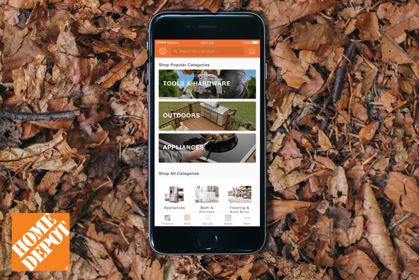
Our first client was Home Depot, who came to us with several pain points and business goals regarding their mobile iOS and Android application.
The primary objective's were to:
1) Enhance the Browse Experience for the native mobile app.
2) Increase user engagement with specials and promotions.
3) Increase time in app with a discovery-based approach from browsing to purchase.

Measuring Success
In order to determine whether or not we were on the right path, we set out with a few primary goals that we could measure:
1) Increase in percentage of traffic to the product detail page
2) Increase in purchases through the browsing flow (passive and active buyers).
3) Increase engagement with seasonal specials and promotions.
The Process

The Users
Home depot’s user base was was broad and ranged from first-time home owners to DIY'ers to older contractor's that utilized very little technology.

Research Method: Comparative Usability Evaluation
Goal: Get an understanding of how the Home Depot app compared with other competing retailers by running participants through several task-based scenarios of the current browse experience. The study focused on:
• Task Success (Completion)
• Flow-Efficiency (Time)
• Overall Usability and Ease of Use (Observational)
Results: Comparative Usability Evaluation

What We Learned
When analyzing the data from the comparative usability studies we learned a few things:
• The app had a less than ideal navigation from a parent category item like ‘Outdoors’ to a specific product, such as a Grill.
• Some of the categories went down 5+ layers deep which made finding the right product very tedious.
• The user was able to eventually complete the task of finding a specific product with an average of 14.6 seconds.
• The focus needed to be around improving the navigation experience for browse and frequently testing along the way.
The Approach
After we validated that there was in fact certain issues that could be improved, we took all the information that we could gather, both quantitative and qualitative, and used that information to help inform our design decisions moving forward.


Usability Studies
Along with the Home Depot team we planned, recruited, scheduled and conducted testing for each phase of the project. The intent for the tests were to validate (early on) the efficiency and usability for each concept we designed. In addition, we wanted to make sure that the presented content aligned with the user’s expectation throughout their entire experience.

App Store
• 4.7 out of 5 Star Rating (134.3K total)
• #47 Retail Shopping
• 5,000,000+ Installs
Google Play
• 4.3 out of 5 Star Rating (44,237 total)
• 5,000,000+ Installs
Comments ()